Or should that be ‘Black and White or Colour’? Traditionally street photography is de facto done in black and white. That’s not just because many of the early masters only had access to black and white film but also because it’s seen to be a more authentic style for this type of photography removing any distractions that colour may bring.
Cartier-Bresson was famously disparaging about the medium of colour in photography and saw colour as technically inferior and aesthetically limiting. Whilst at least some of this was because of the limitations of colour film itself during his time it’s also because he believed in the importance of capturing the essence of a moment in its purest form.
Other famous street photographers, most notably Joel Meyerwitz, Helen Levitt, Harry Gruyaert and Fred Herzog have embraced the use of colour in their street photography however.
In his book How I Make Photographs Joel Mayerowitz says:
“Ask yourself what it is you mean to say. If the graphic world is important to you, choose black and white. It is your responsibility to do what is right for you and to do it open-heartedly, so that everything you see is shaped by your belief that black and white and all shades of grey in between will allow you to render objects in space and time and light in a way that pleases you.
Joel Meyerowitz – How I Make Photographs
If colour is what gets you, open yourself up to that and see how complex, rich, and interesting shooting in colour can be.“
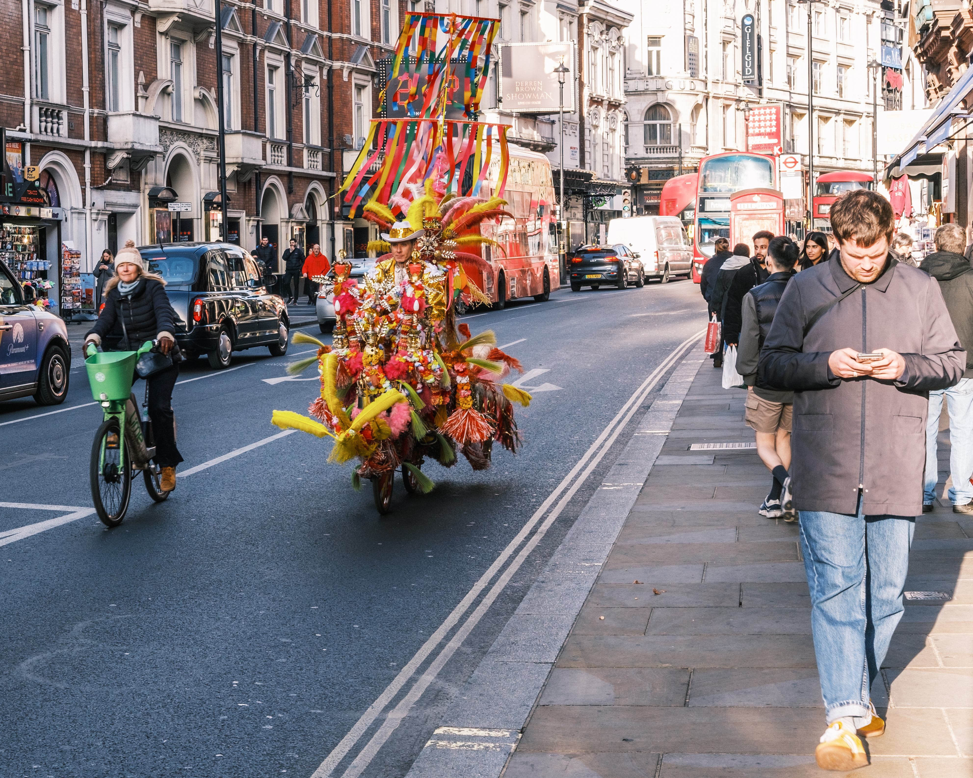
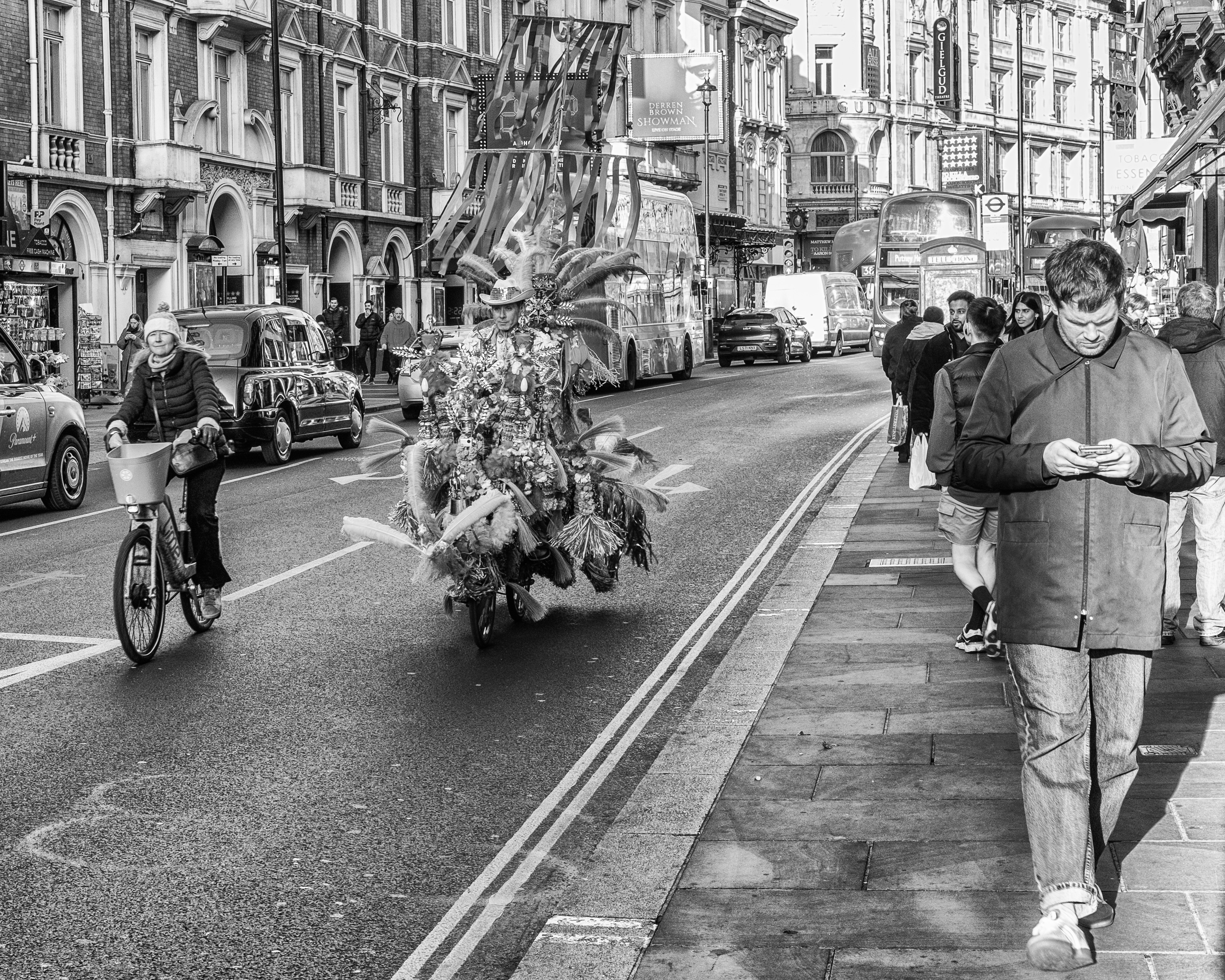
To illustrate what Meyerowitz means I’ve create a black and white version of the above colour image below. The immediate thing you notice is that the colourful cyclist at the centre of the image has really merged with the other two main subjects (i.e. the woman on the bicycle to the left and the man looking at his mobile phone on the right). If anything the man with the mobile phone, because he is further forward and not centre of the image has become the main subject. Clearly this was not the intent of the image. The cyclist bedecked in ribbons and feathers was meant to be the main pint of interest for this photograph.
Here is another image where colour may of may not add to the image.

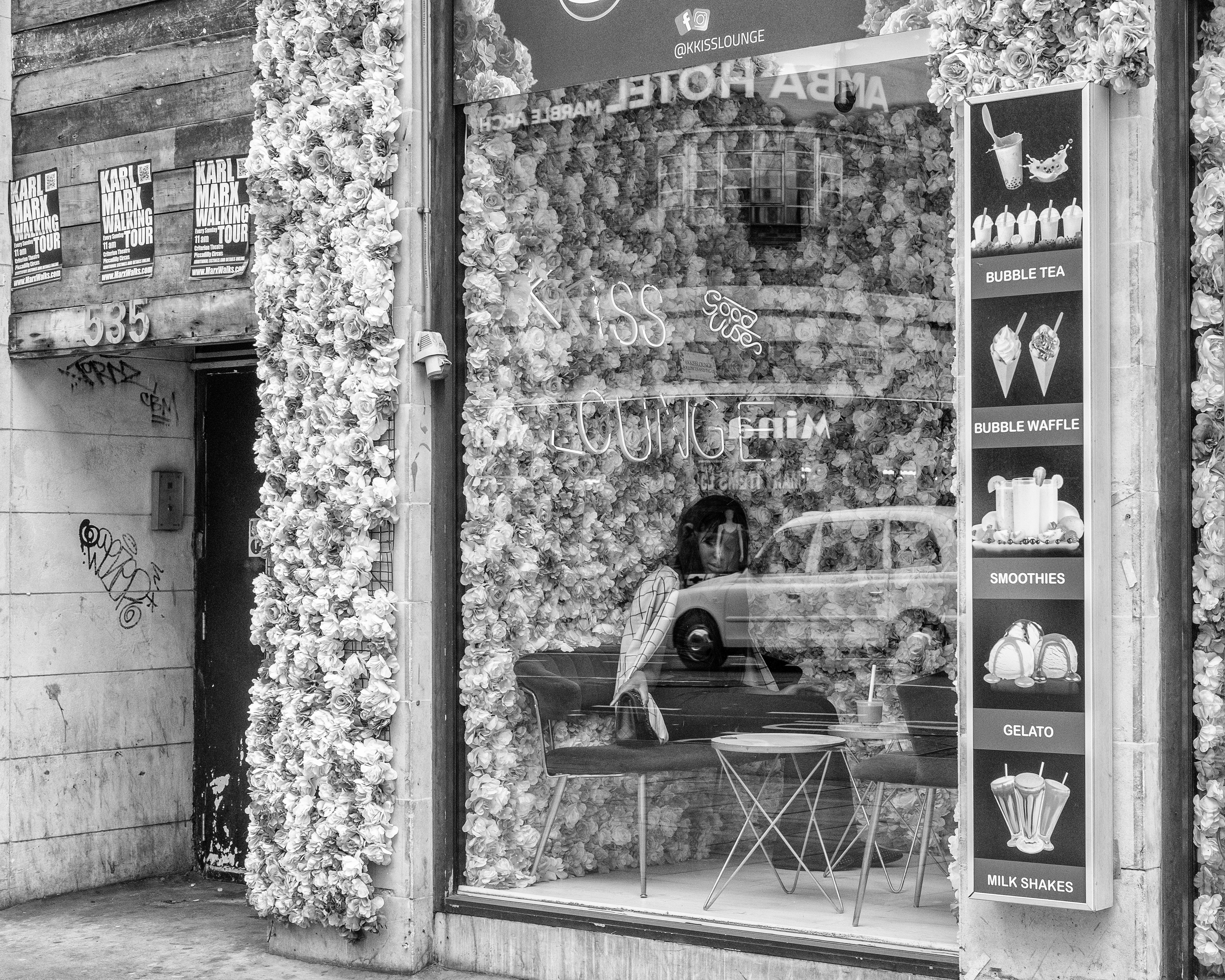
For this image I am less sure if colour adds anything. Whilst it may seem that the flowers around the window would need to be in colour you will see that they are basically in three colours pink/purple which render as a shade of grey in the black and white image, and white. The real area of interest in this photograph is the woman sitting inside the lounge. Being surrounded by colour detracts from that somewhat.
Maybe the last word on colour vs. black and white should be from Saul Leiter. Leiter not only defied categorisation in terms of his photographic genre (being a master of street, fashion, portrait and nude photography) but also switched seamlessly between the use of colour and black and white across all of these genres.
When Leiter died aged 89 in 2013 he left behind two East Village apartments in New York filled with paintings and photographs from his long and productive life covering all of these genres. So vast was his collection that even now the foundation set up to protect and publish his work is sill uncovering new finds over ten years after his death.
To quote the great man:
“We live in a world of color. We’re surrounded by color.“
Saul Leiter, Forever Saul Leiter
So let’s embrace colour, even in the traditional B&W dominated genre of street photography.


Leave a comment